On this episode, we’re going to be talking about video best practices for social media advertising. This includes strategies you can use to become a top performer with your ad campaigns. Let’s get into it!
Hey, what’s going on? My name is Gabe, founder at Facqt, and you’re listening to Straight Facqts.
In the previous episode, we talked about audience consumption habits. This is going to be building off of that conversation.
So the first one that we’re going to talk about is leading with the benefit. In the last video, we talked about how audience consumption rates drop off just after a couple of seconds. Well, the learning off of that is advertising on social media is not like traditional media.
So growing up, you typically see commercials where they build the beat, build the story, drop that beat at the end, and then boom. It’s much more impactful because they built that story and you get an ‘aha’ moment about their product or service. This makes you more inclined to purchase it.
However, that’s not the case when it comes to social media. Also, previously you were able to change the channel.
“Make sure there is no frame wasted when you are talking about your benefit or service.”
Now if you keep scrolling, you can watch that cute puppy video or something you have higher confidence in that’s more entertaining than an ad.
So instead of having that benefit at the very end, you want it to be at the very beginning. This way the highest volume of people are aware of why they should purchase your product or service.
Plus, this is going to incline people to watch your video further. It’s also going to be more impactful for your brand for offline conversions as well, so people can be aware of it.
They may not click through, but because they’re aware of what makes you different, that’s going to increase your organic search. It can improve your paid search as well or anything within your marketing funnel because with Facebook, it’s a top of funnel service.
Having more people aware of your benefit is going to have a positive ripple effect for everything else that is down funnel. So you certainly want to lead with that benefit.
One thing that I would recommend is, don’t just lead with that benefit, also be aware of the opening scene. A lot of the times you watch videos in the first three seconds and it’s just buildup. Then they have the benefits featured after.
So in the opening scene where text is, make sure there is no frame wasted when you are talking about your benefit or service.
“When your copy and visualization match seamlessly, you’re going to give the audience a better understanding of your product/service.”
Now another best practice for video is you want to be able to visualize the benefits. Not just copy — which is very important because you want the audience to read what’s going on — but also a visualization of that benefit.
So with that visualization, the audience is going to have a deeper conceptualization of your benefit. When your copy and visualization match seamlessly, you’re going to give the audience a better understanding of your product/service. It’s going to be easier for them to understand why the heck are they clicking on the ad.
If you’re not visualizing what your actual benefit is, then it’s going to be more complex for the audience. And the more difficult it is for them to be able to understand, the less likely it is for them to engage and become a customer.
Humans are very lazy by nature. Even if you like to think that you have a high intellect, you still want to be lazy.
Even if you are selling a complex product or service, you still want to be able to simplify that as much as possible, because when people are looking at ad, they’re not going, “Man, I really want to think right now.” Therefore, you want to keep it simple. Have that visualization of the benefits for them.
“If you’re producing a minute and a half to two-minute videos, that’s going against the flow with how audiences consume.”
You also want to keep the length of the video short. There is a time and place for long form video. However, you want to have the emphasis of the videos that you produce to be 30 seconds or less, because that goes with the grain of how audiences consume on social media.
If you’re producing a minute and a half to two-minute videos, that’s going against the flow with how audiences consume. It’s also going to take a much higher volume of effort to be able to produce those. So you want to have it under 30 seconds.
Now, I originally was very tight for 15 seconds or less, and there is still truth to that. However, TikTok recommends between about 20 to 34 seconds, I believe. So if you’re talking about social media as a whole, it’s okay to have a video that’s longer than 15 seconds.
If it’s under that relative 30-second mark, my rule of thumb is make it long enough to be able to breathe so you can give a proper messaging for what your benefit is. That is going to be a good step forward.
But if you’re doing it at 45 seconds, not only are you going against how the audience typically consumes on social media, but you’re also putting too much effort into making those videos.
Instead, you can save time with that additional 15 or 30 seconds and possibly build that into two different concepts and have them compete against each other. That’s going to be a better use of your time.
“The more that you can simplify those messaging points and really direct it to specific benefits, the easier it will be for them to understand and take action.”
You also want to be able to optimize for sound off. So this is going to be different across placements. On Meta, 85% of the audience listens with the sound off; on stories, 60% listen with the sound on or 40% listen with the sound off; and on TikTok they don’t release their data.
It is more audio prevalent, but you still want to optimize for that sound off by having captions. Include copy that the audience is able to understand because there’s a good portion of people who consume with the sound off.
Also, by having copy on the video, you’re able to give the audience a more seamless understanding from the copy and visualization points. The closer that those two are able to tie together, the simpler it is for them to understand and take action.
In fact, if you tell somebody to do 10 things, the likelihood that they do one is going to significantly drop in comparison to if you tell them to do one thing. In the end, they’re more likely to do just one thing.
So the more that you can simplify those messaging points and really direct it to specific benefits, the easier it will be for them to understand and take action.
A good way to structure it is to have everything else following that opening scene support that benefit. So you’re not giving them benefit after benefit. Cause then they’ll be like, “Whoa, I don’t know which one I care about.” Instead, you’ll give them more of the North Star benefits or what you believe is the ultimate benefit.
If you give them too much, that will lead you to a high variant of response types. So simplify it as best as you can.
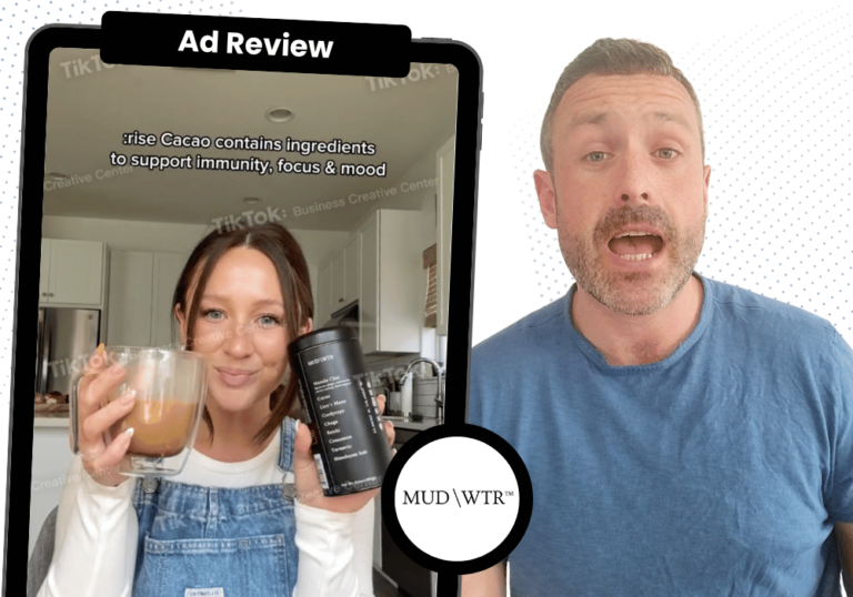
“91% of the ads featuring a person’s face attract more attention than ads without it.”
Also, use the human face. Eyes are drawn to people’s faces. There’s a statistic that I did not share in the last video, but 91% of the ads featuring a person’s face attract more attention than ads without it.
We’re constantly striving to get our audience’s attention, and using someone’s face in your video in the opening scene is going to make a big difference.
So these are a few things that I would recommend for you to be able to test. And there are several different ways that you can do that. You can do it through studio production. You can do it through a cell phone, with just a selfie. Furthermore, you can do it through video libraries. You can also do that through influencers.
There’s a couple different ways that we’re able to use the power of the human face. The better that you’re able to implement that, the more likely you are going to stop people from scrolling and actually interact, engage, and care about clicking on your ad.
“Test different thumbnails that you produced, where you have the copy or the headline within that static image front and center with your benefit.”
Another thing as well (and this is one of the more underutilized aspects), I’ve also had better success with this than switching out headlines, and that is thumbnails.
Right now, the way thumbnails are produced for your videos are: the AI goes through different scenes in your video, they test different screenshots, and hope that it’s going to be best.
Well, you’re not giving it the best availability of what your video can be. So there could be no particular strong scenes that are great for a static image. Instead, test different thumbnails that you produced, where you have the copy or the headline within that static image front and center with your benefit.
It’s a possibility that the video does not have a strong visualization from an image standpoint. Hence, test those different images that are outside of the video. By doing this on certain occasions, we’ve been able to lower the CPA by 15% — just by thumbnails.
So that is one thing I would definitely recommend for you to do. It’s also pretty quick to test as well. Moreover, it’s the very first thing the audience sees.
That affects the impact that you have. About a hundred percent of the volume of your impressions delivered will be aware of your thumbnail. That’s going to be very high, which is why we’ve been able to have success testing it.
“The less they think, the more they’re going to interact and trust the ad you’re delivering.”
You also want to use the proper dimensions as well. So typically this is going to be 1080 x 1080. This is one thing that I notice a lot of clients not doing, and you can get an easy lift by doing so.
Make the dimensions for Stories as well. When you make it 1080 x 1920 instead of 1080 x 1080, you are making it more native on the audience’s platform for Stories. This will allow the audience to have a more seamless interaction. And the less they think, the more they’re going to interact and trust the ad you’re delivering.
“Using split screen is a cheat code that we have to really boost the performance for our clients.”
Oh, I will throw another one in. This is actually the biggest tip out of everything: use split screen.
And the reason why you use split screen is the audience is able to understand what the benefit of your product is, within 3-5 seconds of your opening scene.
So if you have a ‘before and after’ with your product, and you’re able to make the audience understand that this is them now and with your product this is going to be them after — and it’s a good visualization of how your product or service will benefit them — that will be a big leap.
That is a tip, and tip is a very weak word, but using split screen is a cheat code that we have to really boost the performance for our clients. This is because it speaks to leading with the benefits, but the audience is also able to conceptualize what the benefit is at a much quicker rate than a traditional video where you’re only using one screen at a time.
So there we go. Those are video best practices! There are many more incremental tips and tricks that I will be able to talk about moving forward, but let’s get into videos now. Let’s test those videos and rate them based off of what we just said.
Ad Review: Backpack Brands
Today we’re going to be rating three different video ads from three different backpack brands. Let’s get into it. So the first one is, I can’t even pronounce this and I hope people laugh at me for trying that: Fjällräven. Into it, we go!
Fjallraven Ad
All right. They start with their logo and they do it cleverly. It’s very quick and then it rotates and then goes into their backpacks. It shows the versatility of their backpacks visually.
The one thing that I would say is weak is it doesn’t tell me what’s special about their backpacks. It’s just more about the look of the backpack. It would’ve been great for a copy because there’s different sizes.
You can talk about backpacks for who you are and where you’re going or something to that nature. Then, you can be able to just have: why are we showing these backpacks, what’s the purpose?
They look different, cool. But a better description of what makes them different or even talking about the material would be great, even though they’re not really showcasing the material. They’re just showcasing the designs.
Look, so it’s okay. I’m just the hater. All right. Let’s get into number two! Number two is Herschel Supply Company.
Herschel Supply Co. Ad
Okay. I’m still not a big fan. So they start zooming in on the backpack, and you see someone carrying it around with them, just walking. You see their face. You see them zipping things up and down, interacting with it. They look cool and trendy.
The one shot that I like is there is a split screen, or it’s a horizontal cut of three different backpacks. You also see the person. It looks like they’re in New York, exploring New York. I like that visual.
The audience has a better tie into their backpacks. You see all those pretty backpacks going throughout the commercial as well, and at the very end she’s with her friends and laughing, which is good.
So you’re seeing the human element that they’re enjoying it, which is deeper than the previous video that we watched. And I like how they are pushing more of a brand. That is more of the benefit than the actual backpack itself.
I don’t speak backpack language, unless if I’m dancing, but instead of just showing the backpack like the previous video, it’s pushing forth a stronger brand, especially since there’s a person in there as well.
So I would say that it is better than the previous video, but still not a home run. Good. And the last one is, Timbuk2.
Timbuk2 Ad
So this is a collab from Timbuk2 and ASTRO Games.
All right, so they open the scene with talking about Timbuk2 and ASTRO gaming. So they’re representing the collab. Good for branding. However, we’re rating these under an acquisition lens, and that is not a strong acquisition move.
I know they’re doing a collaboration. But I want to know who they’re collaborating with instantly. So have that either be a quicker scene or have the logos or the copy be over the video as it’s going, because those are valuable seconds and the audience isn’t understanding why they’re watching the video.
You’re going to scare most of them away instead of leading with the benefits.
“It’s not the most cohesive messaging.”
Then you see some guy gaming but it’s about a third of the way through before we even see a backpack. They’re showing headphones in there for gaming, but this is already halfway through the video, and it’s not the most cohesive messaging.
I wish there was a better build because you’re just seeing attempted trendy visualizations of their product, but it’s really not getting that much. Then they show putting a passport in the backpack as well, which is kind of off the wall.
Nowhere else in the video do they talk about travel, like video game travel. I mean, yes, I understand, but you’re taking a more high variant concept in bringing it in. Gaming does not necessarily mean international travel. So throwing that in there kind of puts me in for a loop a little bit.
You can say branding, but it’s just not a strong tie, and I don’t know why. I know why they put the passport in there but it’s not a good idea. And then you see them at the very end packing up their backpack. Bro, do that in the opening scene. That should have been your opening scene.
I can take the argument with the guy having the face. But yeah, that is not smart timing. At the end, they go for the Timbuk2 and ASTRO gaming collab. So they do that twice. I understand why you do it twice. But to me, it’s a little bit much.
Choose your place to do that. And if you’re going to do it in the beginning, be a little bit more intelligent for placement on social media. It just feels like a thrown together compilation of their backpack, and it could have done a better job of highlighting their product.
Final Rankings
So rating them, I would go Herschel Supply Company, numero uno, followed by Timbuk2. The reason why is they do talk a little bit more about their benefit.
I would give it about a B. We’ll go B+ to be nice. And then Timbuk2 is a C+, followed by Fjällräven. I can’t pronounce that but it would just be a C. It’s still in the same ballpark as the other one, Timbuk2.
But yeah, that is our show for today! Look forward to the next one. And with that, any questions that you have, feel free to reach out to us through socials. Chat later.
Those are video best practices for Paid Social!
Watch the video here: